Build a live running dashboard in Claude, no extra app needed
By Toby Pattullo
Australian Deaflympic marathon and ultra runner, and the solo developer behind IcuSync.
Also cycle? Everything here works the same way for Ride data through the same connector. Just ask for a cycling version instead of a running one, swap pace for power and FTP zones, and drop the running-specific panels. No separate guide needed.
If you're using IcuSync to connect Claude to Intervals.icu, you already have everything you need to see your training visually, not just talk about it in chat. You don't need a separate coaching app or another subscription. You need Claude and about two minutes.
This works because of a feature called Live Artifacts, available in Claude Cowork. A Live Artifact is a page Claude builds and keeps connected to your data source, in this case your IcuSync connector, so it pulls fresh numbers when you open it rather than showing you a snapshot from whenever it was created.
What you'll end up with
A single page with your current fitness and fatigue, your weekly training volume, your power curve, your personal bests, and a full breakdown of any individual run, splits, heart rate, running form metrics, interval quality, all in one place. Click on a run in the recent activity list and it expands into a deep-dive for that specific session.
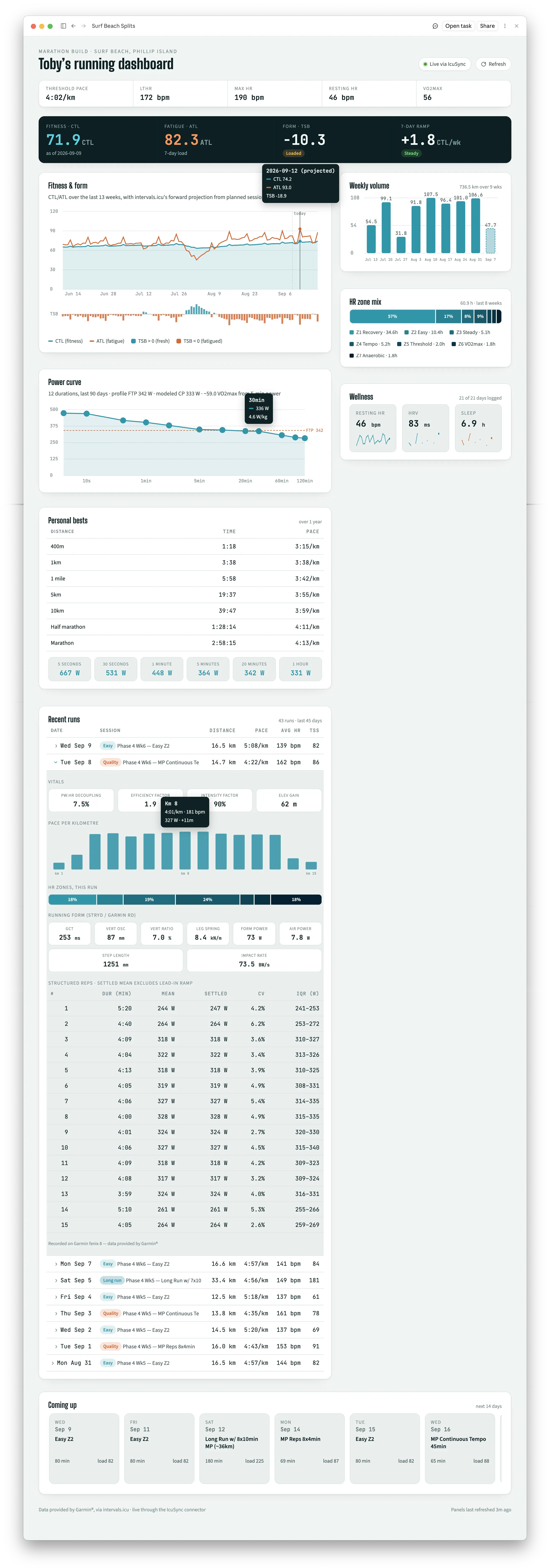 A live dashboard built from this prompt, connected to IcuSync.
The prompt
Open Claude Cowork and paste this in. It'll ask a couple of clarifying questions first if anything about your setup is ambiguous, then build and publish the dashboard.
I want you to build me a live-refreshing running training dashboard, published
as a Claude Artifact, pulling data directly from my intervals.icu MCP connector
called IcuSync, using the artifact's live MCP capability so it's real live
data, not a static snapshot.

Panels I want:

1. Header strip: name/subtitle, a "Live via [connector]" indicator, and a manual refresh button.
2. Athlete stat strip: threshold pace/FTP, LTHR, max HR, resting HR, VO2max.
3. A scoreboard: CTL (fitness), ATL (fatigue), TSB (form), and 7-day ramp rate.
4. Fitness & form chart: CTL/ATL over the last ~13 weeks with TSB as a diverging bar underneath. If the tool returns a forward projection from planned workouts, show it as a dotted continuation, but explicitly note near the chart if there are few or no planned sessions logged ahead, since in that case the projection just assumes training stops and isn't a real forecast.
5. Weekly volume: bar chart of distance per week, last 8 weeks.
6. HR zone mix: stacked bar of time-in-zone across recent runs. Scope this to the last 3-4 weeks rather than 8, since it needs a detail call per run and a wider window will be slow to load.
7. Wellness: small sparklines for resting HR, HRV, and sleep, whichever of these I actually have data for.
8. Power curve: best power for a range of durations from 5s to 2hrs, with a dashed FTP reference line.
9. Personal bests: a table of PR times/paces from 400m to marathon, plus a row of power-duration PR chips.
10. Recent runs table: date, session type, distance, pace, avg HR, TSS. Make each row clickable, expanding an inline "Deep-Dive" section for that specific activity showing:
    - exact per-km splits (pace/HR/power) as a bar chart
    - aerobic decoupling, efficiency factor, intensity factor, weather, elevation
    - a mini HR-zone bar for just that run
    - running form metrics (ground contact time, vertical oscillation, leg spring stiffness, form power) only if the watch or pod actually recorded them
    - a table of structured/interval reps, showing mean vs "settled" power excluding the lead-in ramp and coefficient of variation, only for runs with structured reps
    - a climb segments table, only for runs with real elevation
    Each of these sub-panels should disappear cleanly, not show an empty or broken box, when a given run doesn't have that data.
11. Coming up: next ~2 weeks of planned events, highlighting the peak or key session.
12. A footer with any required data source attribution, pulled dynamically from the API responses rather than hardcoded, since it varies activity to activity.

Design requirements:
- This should look like a purpose-built training tool, not a generic AI dashboard. Pick a real, deliberate color palette and typography pairing, and make sure it works in both light and dark mode.
- Every panel should refresh on its own interval, and show a stale-data or unavailable state gracefully if a call fails, rather than breaking the whole page.
- Responsive and usable on mobile.

Ask me clarifying questions first if anything about my setup or preferences is unclear, then build and publish it.
Before you paste this in
A few things worth knowing so nothing here surprises you:
- You need a paid Claude plan. Live Artifacts run in Claude Cowork, which requires Pro, Max, Team, or Enterprise. It won't work on the free tier.
- It's not a public link. A Live Artifact connected to your data never gets a shareable public URL, on any plan, because it's pulling your data through your connector. You build your own copy, you don't send someone else a link to yours.
- Once it's built, it's with you everywhere. It shows up in the Artifacts section of the Claude mobile app too, so you can open your dashboard on your phone whenever you want, not just at your desk or on your computer.
- Some panels depend on your hardware. Running form metrics (ground contact time, vertical oscillation, leg spring stiffness) only show up if you're running with a Stryd pod, or a Garmin with Custom Streams configured in Intervals.icu. If neither applies to you, those panels correctly won't appear, that's not a bug.
- The forecast chart is only as good as your calendar. If you haven't logged planned sessions ahead of today, the fitness projection will show you coasting to full freshness, because it has no future training to account for. That's a data gap, not a real taper plan.
- This list of panels is a starting point, not a fixed spec. Remove anything that doesn't apply to you, add anything that does. A few examples:
- No power meter or Stryd pod? Drop panel 8 and the form metrics from the deep-dive.
- Training for something other than a single race? Swap "Coming up" for a countdown to your actual event, or drop it if you're not racing anything specific right now.
- Also ride? Ask for a second tab or a toggle that switches the whole dashboard between running and cycling views, using the same connector.
- Chasing a specific goal, like a sub-3 marathon or a weekly mileage target? Ask for a progress panel against that goal instead of a generic scoreboard.
- Once it's built, keep talking to it. This is your dashboard, not a fixed template. If a chart is confusing, a number is in the wrong place, or you think of something better after using it for a week, tell Claude what to change and it'll update the same artifact. Treat the first version as a draft, not the final one.
Why this is better than it sounds
The reason this works well is the same reason IcuSync exists in the first place: raw data handed to Claude, with Claude reasoning about it freely, beats a fixed dashboard built by someone else's assumptions about what you want to see. If you want a different panel next month, you don't wait for an app update, you just ask.